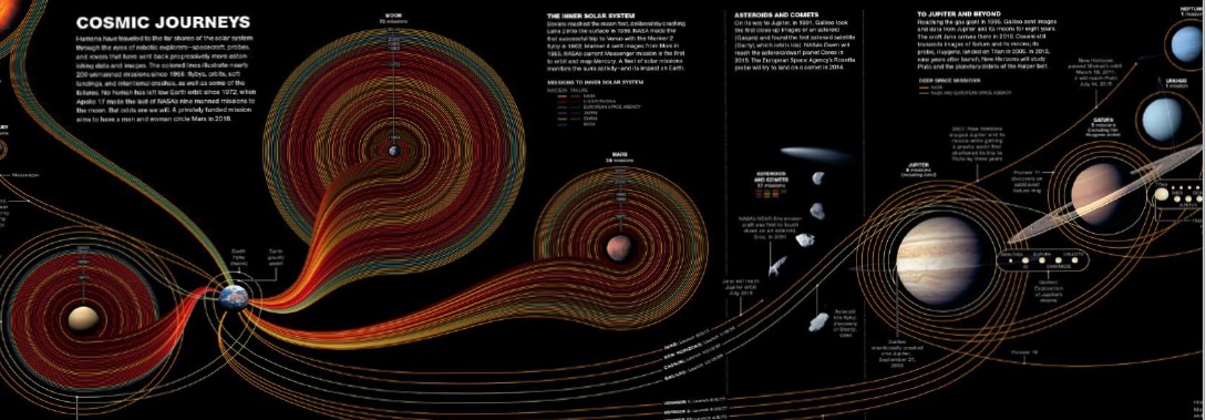
Infographics and Data visualisation
Infographics and Data visualisation
Visual presentation of news is now an integral part of storytelling. The information
gathered has to be divided in what can be expressed with images and what can be
said with text. Using powerful tools like charts, timelines, maps, scales and relationship
diagrams, visual journalists make information clear and useful to the readers.
From figurative representations to data driven visualisations, infographics fit into different
editorial models and reader targets.
The main objective of this training is to help the editors and artists to think visually
to conceptualise and execute graphics in their publications. The hands-on exercise
will help them to go through the full cycle – from gathering information, research,
analyzing the data, planning the graphic, sketching and to the actual execution. It will
provide them a critical view of this discipline and the responsibility that comes with
this powerful visual language.


